The relaunch of Ampol was much more than a nostalgia play, with the brand retaining potent equity in Australia as a trusted Tier 1 fuel provider, despite decades of absence from the category.
To fast-forward the business through twenty years of evolution whilst retaining its original DNA, the leaning ‘A’ comprised of strong red and blue colour bands drawn from the original logos—a new, forward thinking identity to connect Ampol with a new generation of customers, priming Ampol to become once again Australia’s most loved and admired premium fuel brand.
The rebrand and positioning work for our friends at Gelatissimo.
With a prolific maturing gelateria business operating outlets worldwide, the client engaged our team to transform the Gelatissimo brand to establish a compelling and enticing identity for the future.
Our client challenged us to build a strong brand identity for Gelatissimo’s next chapter – a creative launchpad for elevated experiences, celebrating unique ingredients, creating eye-catching packaging, and immersive, innovative store design reflecting the business’ obsession with making the freshest gelato.
Our mission was to inspire all the senses, dialling up the Gelatissimo experience in-store and at home, launching an internationally celebrated brand, ready to stand out and lead.
Our new Gelatissimo brand was inspired by the fun and nostalgia of traditional Italian gelaterias, with a distinctly indulgent and flavourful twist. The logo reflects gelato scoops and dollops supported by luscious, swirled patterns in a zesty, fresh palette.
The Gelatissimo brand identity is truly ‘flavour obsessed’ from colour palette and typography, through to graphic language,
to delight gelato lovers all over the world!
Gurrowa Place is on the land of the Wurundjeri Woi-wurrung people of the Kulin Nation – in Naarm (Melbourne). Situated beside the iconic Queen Victoria Market, it makes up part of the city that has reflected Melbourne at its most vibrant and multicultural for generations.
Lendlease were given the opportunity to shape a new chapter of this storied location – partnering with the City of Melbourne and Scape to develop a mixed-use precinct where work, life and play converge.
Beyond this, it was also an opportunity to shape a place that respected and recognised the area’s rich First Nations history. Lendlease have worked alongside Elders to make sure the stories of the Wurundjeri Woi-wurrung were honoured in every layer to the place’s fabric.
Gurrowa Place is for all of Naarm – an expression of the city’s cultural vibrancy and textural hues. It’s a meeting place for First Nations and all nations alike, where dialogue, culture and experiences are exchanged and interchanged. A place that feels alive with the stories of the past, the diversity of the present and the vitality and resilience that defines its future.
This set the tone for an identity system that embodied and expressed the idea of exchange and interchange – with a deep and authentic connection to First Nations culture at its core. That felt quintessentially Melbourne, but also reflective of this iconic corner of the city too.
We collaborated with Naarm-based First Nations painter, artist and comedian Aretha Brown – who is also the creator of the Kiss My Arts collective. Aretha’s commitment to First Nations historical education – and for taking art into public spaces to challenge stereotypes about Aboriginal and Torres Strait Islander peoples – made her the ideal collaborator for a bold, expressive visual identity.
We commissioned Aretha to bring her unique artistic style – and worked together to tell the story of Gurrowa Place through bold simple-yet-bold motifs. From the bustling Queen Victoria Markets and the variety of produce it offers, to Naarm locals dancing as a tram rattles by. The composition is eye-catching and authentic, offering a glimpse into all the sides that define this part of Melbourne – while honouring the energy and diversity of this one-of-a-kind interchange and the role it will continue to play in the city’s social fabric.
This significant and striking collaboration with Aretha – and her bold illustration – led the brand identity, telling the rich story of Gurrowa Place in lively and organic motifs. The artwork reflected the eclectic culture, Country and future of Gurrowa Place as a thriving point of life intersecting in Naarm.
Aretha created detailed illustrative stories of Gurrowa and bold borders that frame imagery and messaging, adding further dimension to the identity. She also hand-illustrated the Gurrowa Place logo, along with bespoke textural patterns inspired by mangroves and saltwater netting. Having Aretha’s unique style taking form in so many ways gave Gurrowa Place a graphic language all of its own.
The meaningful colour palette further reflected unique elements of the Wurundjeri Woi-wurrung people’s culture, Country and the history of the Kulin nation. This included bright yellow to represent Muyan (wattle) a symbol of remembrance, and shades of olive to capture the colours of the Wurun (manna gum), which forms part of the Wurundjeri name.
The rebrand for Toyota Asia bringing 17 APAC regions together under a unified brand strategy and identity.
Considerable change and competition demand brave thinking to maintain leadership and connection with new generations of customers.
For the first time in its history, Toyota’s Japanese headquarters set a new global vision, transforming from a car company to a mobility company; working towards ‘Mobility for All’ to better connect with tomorrow’s drivers.
How each global region creatively embodied this vision was their own decision to make. Our objective was to interpret ‘Mobility for All’ as a regional brand, to unite all 17 APAC markets - expressing Toyota’s story with relevance, character, emotion and style.
Inspired by the Toyota’s customer’s common desire to move forward, both individually and collectively, we established the positioning ‘The thrill and joy of moving together’ to embed missing elements of excitement and emotion across the entire brand.
This translated to a free-flowing, dynamic brand identity drawing audiences through all Toyota touchpoints and experiences with joy, excitement and positive energy.
An irreverent script typeface was crafted and applied with freedom and attitude, amplifying messaging while disrupting the underlying design grid to ‘dial up the volume’ across communications, supported by a flexible toolkit to further inspire a sense of creativity and freedom.
The chance to define how Australia presents itself to the world is the kind of creative brief that doesn’t come along every day. So, it was Houston’s honour to contribute to Australia’s Nation Brand, adding credibility, substance and competitive edge to Australia’s international reputation.
In partnership with Balarinji’s Indigenous design team, Houston collaborated to define a brand inspired by sunlit, freshwater rivers and bush tracks: the Songlines of ancient country; adding energy, richness and meaning to the ‘Brand Australia’ story.
The result is a brand identity that’s confident, consistent, authentic and instantly recognisable to the world – an identity to accelerate our future and redefine our international reputation, while conveying our irrepressible sense of optimism.
Creating the new identity was a process of fusing creativity with technology, born from the idea that “It’s the things you can’t see that shape the world”. Our challenge was to visually represent the often intangible world of technology and data.
Our solution was the creation of data visualisation software, the ‘UTS Visualiser’. This software allows UTS to input unique data about its faculties, students and research, to create intelligent and connected graphics, which feature prominently in branded collateral and marketing campaigns. These “infinite” graphics deliver a responsive and adaptive brand identity, providing total flexibility.
The UTS Visualiser transforms data into connected graphics that inform a generative brand identity, truly reflecting the university, its research and its people.
We love creating brands that help people and are proud to share our rebrand for Neil Perry's Hope Hospitality Foundation.
Hope Hospitality Foundation was born to spread hope. Having begun service during the uncertain and challenging months of 2020 following fires, floods and everything in between, Hope Hospitality Foundation launched to provide nutritious, wholesome meals to those who need it.
Founded by celebrity chef Neil Perry, Hope Hospitality Foundation draws from years of chef experience to prepare heart-warmingly delicious, nourishing meals for organisations on our social frontlines.
Our brief was to support and propel the organisation’s ambitious mission with a brand to connect with partners, donors and diners, filling even more plates with quality meals for Australia’s most vulnerable people.
The organisation’s simple mission to ‘provide hope one dish at a time’ inspired an identity featuring multiple ‘dishes’ via the primary logo’s stacked typographic treatment, with circular letterforms representing several plates on the move, to wherever they are needed.
A bright, sunny colour palette of warm cream, tangerine and charcoal with accents of butterscotch add to the sense of warmth, positivity and optimism.
Typography is an important aspect of Hope Hospitality Foundation’s visual language, providing impact and positivity across all communications.
Photography style is a celebration of quality, community and craft – the many elements that contribute to Hope’s exceptional fare.
To work with Qantas on a brief like this is quite simply a once-in-a-generation opportunity.
There’s a delicate balance that needs to be struck when working on such a revered brand – the need to contemporise it while not straying too far from what everyone knows and loves.
The key opportunity for us was in contemporising the ‘roo. Making it more streamlined, and simplifying the shape. It’s evolved beyond a literal kangaroo – it’s become a unique brand symbol.
It’s been 10 years since Qantas did this. The new identity is truly reflective of the brand we know today. It’s the kind of investment that allows Qantas to compete on a global stage as a leading premium airline.
The automotive world is shifting globally. And even its key players – no matter how strong their legacy – need to think of ways to stay ahead.
As one of the country’s strongest brands, Toyota Australia understood it was time to think big, rise to local challenges, and push for cultural change as well as communication change. They came to us with a mission: to take the company in a strong direction and create a greater customer connection too. With a global mandate and a local purpose, we collaborated on a deep level to define a rebrand that would help Toyota really carve out that competitive edge – all while expressing the power of mobility.
A core part of Toyota’s refresh was evolving an expressive visual identity, inspired by the concept of human mobility in all its forms. The refreshed brand identity and toolbox captures momentum and energy, reflective of Toyota’s vision to provide mobility for all.
We developed a toolbox for Toyota that would cater for the stretch they need. Two core graphic elements take prominence – the Ellipse representing their history, and the Circle, representing the human atom with its energy and movement. It’s an intelligent design system that highlights Toyota’s technological innovations, reigniting the spirit and feeling of the brand.
An adaptive identity that reflects the multi-dimensional forms of UAP’s unique creations and their flexible way of working with changing artists, craftspeople and collaborators. These changing forms are inspired by UAP’s malleable approach, their extensive process and the way they successfully adapt to working with very different artists and materials. The UAP logo and identity moves into a 3D space reflecting the dimension of UAP’s craft and place making pieces. The Identity respects the artists’ energetic and expressive work by providing a very neutral palette of black, white and greys. We aimed to establish UAP as thought leaders in their industry by strategically communicating their visionary practice.
A significant collaboration between internationally acclaimed designer Marc Newson and Caroma.
Incorporating an entire new brand identity to reflect the unique relationship between Newson and Caroma, we developed a creative response across every touch point- including product, packaging, POS, web, communications, and direct. A specially designed gallery in Redfern opened its doors as part of the campaign, allowing trade to fully experience the Caroma Marc Newson Collection. We needed to ensure the brand was of equal stature, showcasing this beautiful new product range while impacting in a highly competitive marketplace. Marc Newson’s bathroom range was elegantly photographed and presented as a real showcase of excellence. From the gallery experience to the oversize brochure this is a campaign that truly reflects the significance of such an important design collaboration.
Grant Harvey, Photographer
In partnership with iconic Sydney restauranteurs and function venue operators @GrandPacificGroup. @YesChefDelivers has been created to answer the need of Sydney couples and families seeking home-delivered dining solutions; redeploying its top kitchen talent from the likes of @GunnersBarracks, @SergeantsMess and @TheTearoomQVB to create a range of premium ‘heat and eat’ signature dishes and family favourites to bring comfort, convenience and just a little decadence during unprecedently challenging times.
We named the brand Yes Chef! as a platform for a positive, personality-fuelled brand identity comprised of an oversized logo mark, an appetite-inducing colour palette of chilli red and deep aubergine supported by photography by @craigwallphoto styled by @jennfood, copywriting, naming and production by @blingerss and a vintage illustration style for added charm.
Typography by @lettersfromsweden #lettersfromsweden #ivarcondensed
Founded in 2008 with its headquarters in Paris, The Kooples is a high-end French fashion house offering accessible luxury collections with personality for both men and women.
We worked with The Kooples team to launch the brand’s first standalone retail boutique in Melbourne, Australia.
Our scope included website design, store signage and point of sale collateral, launch event invitations and eDM.
Whether you’re a resident, worker, retailer or visitor, King Street has something to satisfy every interest, craving and creative pursuit. This urban neighbourhood has art, culture, music and entertainment coursing through its veins, powered by good food, and with a welcoming community at its heart. The King St identity reflects this eclectic and vibrant place with a brand mark that is inspired by this attractive destination.
The illustrations by Leon Shore are quirky and playful and capture the spirit of the modern place but also its history.
We launched the future-facing brand identity and voice for Charles Sturt University as it celebrated its 30th anniversary in 2019 as part of an overarching strategy to reverse the trend of declining student load and to address weak brand recognition through brand identity design and signage as well as advertising for student recruitment and career expos.
As part of a broader strategy encompassing large-scale transformation through to 2022, the rebrand brings together old and new to create a bold new look for the institution.
“We know that in a crowded higher education market, we must stand out from our competitors and tell our story clearly and purposefully. Our new brand direction is unique to us; a strong visual statement about who we are at Charles Sturt. It’s about showing we are confident, forward-thinking and progressive, and keeping pace with changes as they occur.” Said Vice-Chancellor Jenny Roberts.
The Pacific Club launched in Bondi Beach to create a home away from home for Bondi’s locals and guests alike. Located on the edge of the Pacific Ocean on the east coast of Sydney, The Pacific Club’s location is defined by a relaxed, sophisticated coastal lifestyle.
The brand identity adopted the flag insignia to honour the heritage of the surf lifesaving clubs dotted along the eastern Australian coastline, establishing a bold and iconic brand identity befitting an iconic venue.
A relaxed geometric sans typeface ‘Ano’ complements an informal yet polished atmosphere. A colour palette of rich blue and bright coral provide contrast within the whitewashed interior environment.
Hermès Man Paris
Working with Acne Studios in Paris, I was invited to art direct and design the Hermes Men tie launch campaign. We had the pleasure of working with world renowned photographer, Willy Vanderperre and the Editor-in-Chief of Acne Paper, Thomas Persson.
Jetstar Brand Refresh
Bacio is a self-initiated product brand concept in development: an Italian vodka soda inspired by the heat of Sicilian summer.
The name ‘Bacio’ is italian for ‘kiss’ capturing the romance of Old Sicily with a range of thirst-quenching citrus flavours of lemon, grapefruit and blood orange.
Rebrand of Australian online foreign exchange company OzForex to OFX
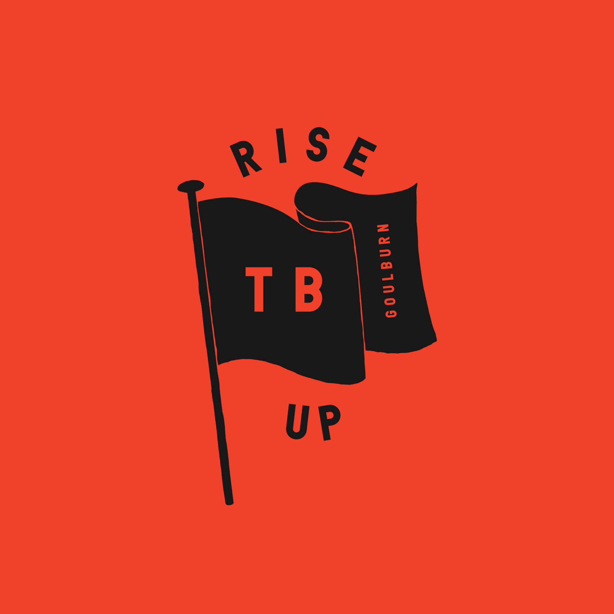
Tribe is one of Australia’s largest and most innovative independent brewers.
In addition to several boutique microbreweries around Australia, Tribe owns and operates a massive contract brewing production facility out of Goulburn NSW, offering high-quality, reliable and scalable partner brewing and packaging services for brands seeking high-volume production capability to share their craft with wider audiences.
As part of a strategy to strengthen team engagement across several remote sites and position the Tribe team as loud, proud and uncompromisingly independent, we created a corporate brand identity that was anything but.
We developed an irreverent and engaging tone of voice, expressed across a series of commissioned illustrations to give the brand flexibility, stretch, merchandising opportunities, and most importantly an unmistakable attitude that reflected their own.
One Neon 3D Film.
Collab with Toby & Pete.
'The Streets of Barangaroo' Sydney Identity
Lendlease’ brief was to dispel the myths of Sydney CBD being soulless and commercial by launching the new Barangaroo precinct as a thoughtfully curated and crafted food, beverage and retail offering.
The illustrative campaign was inspired by the tailored, curated and carefully crafted offerings at Barangaroo. Our vibrant hand-crafted illustrative style brought the advertising to life, providing the campaign with visual cut-through in a busy advertising environment.
The campaign achieved interest and talkability, successfully positioning Barangaroo as a more creatively and internationally-inspired fashion and food precinct than competing shopping and dining destinations in Sydney.
The intricate and labour-intensive hand embroidered artworks featured elements of the food and fashion retail mix, which were then photographed for the final campaign series. All elements of the campaign were hand-stitched; from images to typography to logos.
We created a responsive and intuitive brand platform and identity for Australia’s leading acting not-for-profit organisation inspired by today’s many devices and screens used to view television and film. Given the changing and expanding landscape of the creative arts industry – the rise of Netflix, YouTube, Mobile devices etc, we required a design system that both embraced and challenged current conventions.
We experimented with a range of formats – landing on an identity that connects, expands, reveals and celebrates.
The Lendlease business represents
$9billion with over 4,000 staff globally, and we’re proud to say our strategic thinking and creative output has played a vital role across all levels of the business.
At the core of this project was the transformation and rollout of the global brand. As a strategic project, we developed and defined the entire brand language, core drivers, beliefs and tone of voice, demontrating our strategic capability and branding experience in a competitive global marketplace.
Alex Toohey, Creative Director
Illustrators, Craig and Karl
Chiswick Restaurant Identity, Alex Toohey Design Director
The distinct residential offering of Barangaroo was named ‘Anadara’ and was inspired by the scientific name of a cockle clam – distinct to the region and also reflected in the unique shape of the built form.
The logo design is inspired by the curved scallops of the cockle shell but also the architecture of the building.
We developed Anadara’s leasing colateral, sales suite and digital and outdoor campaigns.
Hermès Man, Designer Alex Toohey
Type design by Alex Toohey
Alex Toohey, Creative Director, Designer
Hermes Man, Alex Toohey Designer
Alex Toohey, Creative Director
Hermès Man New York
Scotch Row Identity for 'The Streets of Barangaroo', Sydney
Client: Lendlease
Alex Toohey, Creative Director
Kirrily Johnston, Alex Toohey Creative Director
Alex Toohey, Creative Director, Designer
Alex Toohey, Creative Director